Wallah! The stop sign.
We work with small business owners for a reason.
This comedy sketch video isn’t that far off the mark of how life can be for the corporate designer. At JSH&P. we love working with all of our clients, because we work with the decision makers. They share their input, we offer up our best ideas on how to solve the challenge at hand. In most cases, there’s a path that truly, makes the most sense, that everyone can be proud of. In the end, however, it’s efficacy that counts. — Did what we do, work?
How about designing a new stop sign?
What if the world didn’t already have a stop sign? How might JSH&P go about designing it, for real?
A little history, first… Mr. William Eno had the concept for the stop sign back in 1911. And the first black on white square sign was installed in Detroit back in 1915. And it was the Mississippi Valley Association of State Highway Departments that put the shape into it, by determining that different levels of concern required different shapes. Back then, the sign was black on yellow. But it wasn’t until 1954 that the white on red sign was born when manufacturers could produce a red reflective material to get everyone’s attention. Of course, today, red is widely regarded as a stopping color.
So, JSH&P, for starters, would want the relevant data and research… and all of the concerns, put out on the table, just like in the comedy sketch. And, just like the designer, we’d probably figure out that we needed something universal to get everyone on the same page, very quickly, to produce the desired result — namely, to stop vehicles safely. However, we might reflect on a key word in that last sentence… “universal”.
Almost every country uses an octagonal stop sign with their word for “stop” on it. Maybe, like the biggest most universal brands in world (i.e. – Nike & Apple), we’d be interested to get rid of the typography. Could a graphic mark alone, do the job, so that drivers from around the world could always recognize a stop sign, and, perhaps, save the good taxpayers a bit of money for creating something simpler to produce?
Here are our options (with two real life versions already being utilized):
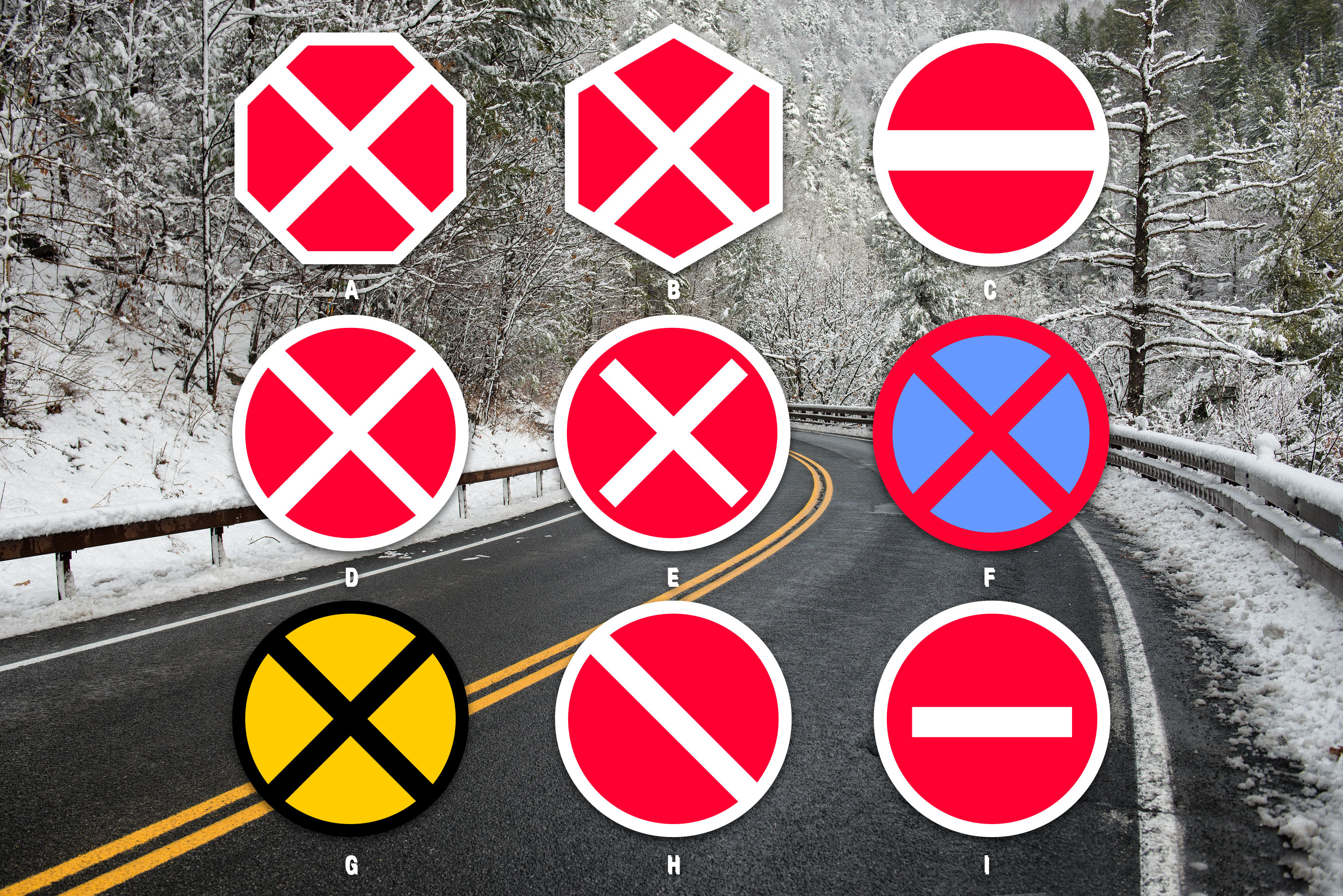
A: Red octagon white X. A strong choice, very distinctive. Our second choice.
B: Red hexagon white X. The angles/shapes created aren’t uniform. Feels off.
C: Red circle white line. Bold simplicity, but does it say anything?
D: Red circle white X. Exceedingly simple and bold. We think this is the strongest sign.
E: Red circle white “X”. Doesn’t seem as strong as D and suggests the English letter “X”.
F: Blue circle red X. Used by a few Eastern European countries like Belarus and Lithuania. Not enough contrast.
G: Yellow circle black X. Yellow truly grabs your attention, but at night, will the negative space be less useful?
H: Red circle white diagonal. Looks like a suggestion instead of a statement.
I: Red circle white dash. Used in Russia. Simplest design, but a dash seems suggestive, as well.
Which would you choose?


Recent Comments