We’re everywhere…

We’re everywhere…

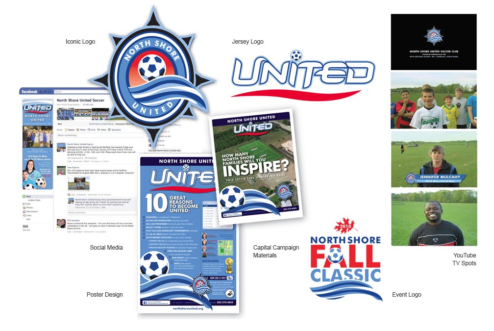
North Shore United Soccer Club

Mark Koenig, my upstairs business neighbor and all-around-good-guy, also happened to be one of the leaders of the Cedarburg Soccer Club.  A collection of 200 Cedarburg families whose kids played soccer.  Just like so many other youth sports organizations, it was local and competitive at introducing and developing kids to the sport of soccer.  But Mark was tired of getting their best kids “poached” from other area soccer programs.

He had an idea to make the club more than just Cedarburg.  Why not form something that could attract families and kids from all over the North Shore area?  And the happy by-product, would be more families, better coaches and more money for the organization to construct better facilities to promote soccer even further.

All they needed was an identity that could bring out their very best.  Suffice it to say, we accomplished that task and then some, as the myriad of mini-vans that sport an North Shore United window sticker can attest.

We set out to create an identity that was every bit as strong as any professional sports franchise.  North Shore United branding helps remind us that doing world-class work, even for small clients, can reap very satisfying returns.

Re-branding an 80-year old company

Re-branding an 80-year old company

Velvac

JSH&P works with entrepreneurs of all kinds.  That’s not just garage-style start-ups or Inc. 500 wanna-bees — sometimes that’s with strongly established companies that still have growth on their minds.  Velvac is one of those firms.  With over $70,000,000 in sales, few would call Velvac a small business, but their concerns and desires to anticipate changes within their marketplace are crucial to their success.

“Velvac called me to provide CMO leadership for their upcoming marketing plans.  A new e-commerce website and complete catalog overhaul were just the beginning of a great relationship.”

The brand’s image had grown a bit stale, but new product initiatives called for a more world-class look and feel, without losing the equity already established over the past 80 years of business.  That takes a deft touch and is just the sort of business relationship that’s a win-win.

JSH&P is providing strategic consultation, design, advertising creative, social media and web support throughout the entire Velvac corporate structure. 

Claim Your No.1 Spot (even if your 14th)

Claim Your No.1 Spot (even if your 14th)

O’Neil Cannon

Not many agencies get the “green light” with a new client by “dissing” the two principals at the firm… but that’s what happened with O’Neil Cannon Hollman DeJong & Laing.  At the time, the firm was O’Neil, Cannon, Hollman & DeJong.

“I told them that they should change the name to O’Neil Cannon because that’s all anyone would remember.  Too bad Mr. Hollman, Mr. DeJong  and Mr. Laing were the remaining partners in the firm!  I suspect they appreciated the honesty… it certainly wasn’t my good looks that won them over.”

O’Neil was the 14th largest law firm in Milwaukee, but their track record of success was as good, if not better, than any other law firm in town — and the firms larger than they seemed to be preoccupied with becoming the strongest firm in the region — abdicating their claim on the city.  By presenting O’Neil as the premier law firm in town, it didn’t matter that the number of lawyers they had was much smaller, they simply needed to appear as strong as their larger counterparts to win their own backyard.

You see, if no one else will stake a claim in an area of your expertise, even if you are much smaller in size, your stature needn’t be.  Go ahead and claim it… BUT, you better be prepared to back it up, and for the level of your brand to be on par, if not greater, than any other in the marketplace.  That’s where JSH&P can deliver results.

JSH&P provided consultive services to the firm of O’Neil, Cannon, Hollman, DeJong & Laing, along with full agency services including print advertising, brand development, web design/production and collateral and promotional design.

New Branding that Soars

New Branding that Soars

Aerofab NDT

Aerofab NDT came to JacksonSpencer because they knew that their existing site was out-of-date.  What they didn’t realize, was that they were about to re-evaluate their entire brand.  Fran Sterns, Aerofab NDT CFO, was approached by JSH&P about not only making their website a better experience for customers and prospects, but improving their branding to better match the high caliber of work their produce.

In an industry that sees imperfection as a horror story, you’ve got one shot to “get it right.”  Thing is, like so many other small businesses, it’s hard to describe the look and feel you want when your days are consumed with meticulous detail.  “That’s where Mike Farley really works his magic,” stated Stearns.

“Sometimes the brand simply needs a few tweaks, along with a more stringent set of rules for managing your brand.” says Farley.  “Far too many businesses get lazy with the scope of their brand.  What happens over time is that you get multiple looks and messages that confuse your customers.  Left unchecked, you spend a lot more money to make the same impact had you stayed consistent throughout.”

The complete process of re-branding had JSH&P designing a new logo, mobile-responsive website, catalog cover and full stationery package for Aerofab NDT.