Wallah! The stop sign.

Wallah! The stop sign.


We work with small business owners for a reason.
This comedy sketch video isn’t that far off the mark of how life can be for the corporate designer.  At JSH&P. we love working with all of our clients, because we work with the decision makers.  They share their input, we offer up our best ideas on how to solve the challenge at hand.  In most cases, there’s a path that truly, makes the most sense, that everyone can be proud of.  In the end, however, it’s efficacy that counts. — Did what we do, work?  

How about designing a new stop sign?
What if the world didn’t already have a stop sign?  How might JSH&P go about designing it, for real?

A little history, first… Mr. William Eno had the concept for the stop sign back in 1911.  And the first black on white square sign was installed in Detroit back in 1915.  And it was the Mississippi Valley Association of State Highway Departments that put the shape into it, by determining that different levels of concern required different shapes. Back then, the sign was black on yellow. But it wasn’t until 1954 that the white on red sign was born when manufacturers could produce a red reflective material to get everyone’s attention.  Of course, today, red is widely regarded as a stopping color.

So, JSH&P, for starters, would want the relevant data and research… and all of the concerns, put out on the table, just like in the comedy sketch.  And, just like the designer, we’d probably figure out that we needed something universal to get everyone on the same page, very quickly, to produce the desired result — namely, to stop vehicles safely.  However, we might reflect on a key word in that last sentence… “universal”.

Almost every country uses an octagonal stop sign with their word for “stop” on it.  Maybe, like the biggest most universal brands in world (i.e. – Nike & Apple), we’d be interested to get rid of the typography.  Could a graphic mark alone, do the job, so that drivers from around the world could always recognize a stop sign, and, perhaps, save the good taxpayers a bit of money for creating something simpler to produce?

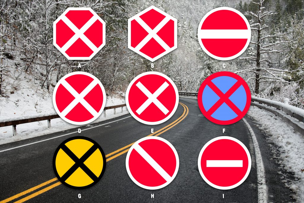
Here are our options (with two real life versions already being utilized):

A: Red octagon white X.  A strong choice, very distinctive. Our second choice.
B: Red hexagon white X. The angles/shapes created aren’t uniform. Feels off.
C: Red circle white line. Bold simplicity, but does it say anything?
D: Red circle white X. Exceedingly simple and bold.  We think this is the strongest sign.
E: Red circle white “X”. Doesn’t seem as strong as D and suggests the English letter “X”.
F: Blue circle red X. Used by a few Eastern European countries like Belarus and Lithuania. Not enough contrast.
G: Yellow circle black X. Yellow truly grabs your attention, but at night, will the negative space be less useful?
H: Red circle white diagonal. Looks like a suggestion instead of a statement.
I: Red circle white dash. Used in Russia. Simplest design, but a dash seems suggestive, as well.

Which would you choose?
 

You have to start somewhere.

You have to start somewhere.

The Science Museum of Minnesota

Almost 30 years ago to the day, I started my advertising and marketing career with an internship at the Science Museum of Minnesota.  Under the tutelage of Art Director Mark Odegard, I learned how to design, how to think in terms of visitor engagement and how to produce work that a team of people could rally behind.  The first major work that I was involved with was for a show called, Dinosaurs!

Complete with animatronic dinos, fossils, complete skeletons and an array of interactive exhibits, the show became the largest the museum had ever put on.  We even sailed the Apatosaurus down the Mississippi on a barge! Talk about some PR value!  Artwork that I created found it’s way on to t-shirts, shopping bags, outdoor billboards and more.  To this day, it is one of my fondest memories.  No wonder I took to my work and have kept at it for all these years!

Today’s Science Museum of Minnesota has a new brand, built in with the equity of so many patrons, visitors and employees who made it all happen.  The visit is well worth it.

You need a Brandbook

You need a Brandbook

The Brandbook

Getting a handle on your brand is pretty much what we do at JSH&P.  Either forming the brand from scratch, or, working to coalesce your existing brand into a stronger, more consistent voice for the best of what your business has to offer.

“Far too many small businesses are working against their own brands by not defining who they are, what they look like and what voice they speak with,” says founder Mike Farley.

Building a brandbook — a simplified version of everything you are — is a great place to get consensus on what makes you – you.  From color choices, fonts and logo forms, to advertising, web and promo items.  What’s more, it pulls together the thinking behind the sales process as well as offering a pathway to future success.

The biggest secret behind it?  Putting a Powerline together is a great start.  Ask us more about it.

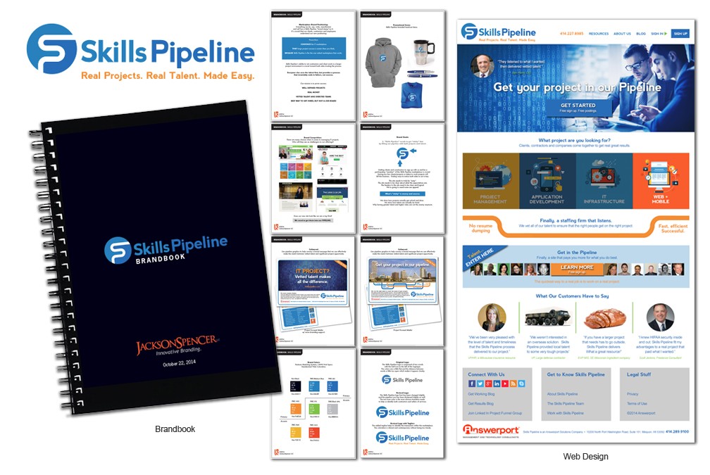
The image above is a portion of an actual brandbook for JSH&P client Skills Pipeline.  Get in touch with Mike Farley to find out how you can benefit from your own and start saving marketing dollars as well as improving the trajectory of your business. 

JSH&P’s Mike Farley

JSH&P’s Mike Farley

A little bio —

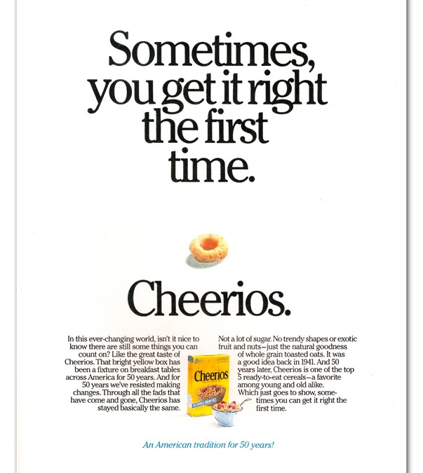
With 30 years of experience, the founder and leader of the JSH&P team is Mike Farley, one of Wisconsin’s leading brand experts.  He cut his advertising and design teeth with Fortune 500 giant General Mills, working the flagship Cheerios brand, as well as CocoPuffs, Yoplait, Hamburger Helper and Olive Garden.

Having worked in Minneapolis during the creative awakening in the late 1980’s, Mike became the youngest Creative Director in town while at Clarke Livingston & Associates.  He was recruited to the Milwaukee area in the 90’s and ultimately started his own award winning design firm Axis Creative in Milwaukee’s Historic Third Ward.  However, the effects of the 9-11 disaster hit the marketing community hard, and Mike was lured to try a new venture with client Econoprint.

Then, in 2007, the itch of the entrepreneur took hold again and Farley started JacksonSpencer LLC in Cedarburg.  It’s there that JSH&P works it’s magic for clients big and small — handling the brand management and leading marketing efforts that not only look good, but add profit to any businesses bottom line.